
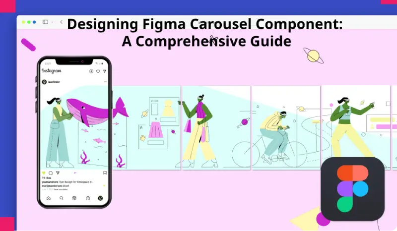
The Figma Carousel Component which includes carousels functions as a vital element in user interface design to deliver interactive exciting content. Figma carousel components facilitate designers to display various pieces of content through a confined interface so users can effortlessly move between different sections. This detailed guide explores figma carousel components while examining their value in design together with strategies for Figma development and practical examples for better user interactions. See More blog
Table of Contents
1) Understanding Figma Carousel Component:
Figma provides UI components that display several images or cards and rotate or slide them in a carousel view. This interface design component is known as a Figma Carousel Component. The components can be found across websites, mobile applications and digital presentations where developers use them to display pertinent content and showcase important products or suggest sorted information. Figma Carousel Component usually contains manual navigation tools such as arrows, dots or thumbnails to help customers browse through different content sections.
The Figma carousel component gives various advantages which strengthen user interaction and boost engagement while creating an improved design experience.
— Space Optimization:
Figma Carousel Component helps designers achieve maximum screen efficiency by placing various content pieces inside compact spaces thus working well with interfaces that need to display abundant content on restricted display areas.
— Content Discovery:
Carousels provide automatic or manual functionality that guides users between various content items which results in longer interface interactions.
— Visual Appeal:
A carousel adds visual appeal when combined with movement because it uses animated effects to lead users toward featured content while grabbing their viewer attention.
— Versatility:
Carousels adjust to different types of content from images through videos to articles and product listings thus providing designers flexibility for various design requirements.
2) Creating Carousel Components in Figma:
As a design tool Figma delivers advanced capabilities that enable users to design and alter carousel elements. A detailed guide for making carousel components in Figma consists of the following sequential steps.
— Define Content Structure:
Establish the content structure of the carousel component during the design phase before starting its development. Establish what types of content will appear in the carousel by deciding between images along with titles and descriptions and metadata fields if required.
— Set Up Artboard:
Figma users must first create a new frame or artboard to function as the carousel component container. Begin with the artboard dimensions that match the combined dimensions of content items and the expected layout.

— Design Carousel Layout:
Design the visual presentation of the carousel component by taking advantage of Figma’s layout grid as well as its vector tools and alignment features. Keep the content items either aligned horizontally or vertically by maintaining an equitable distance between each item on the artboard.
— Add Navigation Controls:
Users should have access to navigation controls which include arrows, dots and thumbnails to switch between carousel contents. Intelligently position navigation controls where they can be accessed easily by users in an intuitive manner.
— Implement Interaction:
Set how users can interact with the carousel through automatic scrolling and touch-based swipe gestures and by using click actions. The prototype feature of Figma allows developers to build interactive simulations of the carousel functionality through its prototyping mode.
— Customize Styling:
Implement design style features to the carousel component so it matches the visual elements of the user interface. Use shades of color across different types of typography while adding animations and shadows to produce attractive carousels that attract viewer interest.
— Create Variations:
The component requires multiple designs that should vary for accommodating different content setups and design needs. You should test various layout designs alongside different navigation options and animation effects in order to determine the most productive design solution.
3) Best Practices for Designing Carousel Components:
The following best practices should be taken into account when developing user-friendly carousel components:
— Limit Content Items:
When content items exceed the number the carousel can handle users become distracted thus reducing the effectiveness of single items. Maintain user engagement through setting an appropriate number of content items limited for the carousel.
— Prioritize Accessibility:
Carousels must be accessible for disabled users because users need alternative navigation options together with descriptive labels for content items. Screen readers will benefit from your addition of both keyboard navigation capabilities and aria attributes.
— Optimize Performance:
The file size of carousel components must remain small by optimizing image compression methods and cutting down animation effects. The optimized file size and performance improvements help to maintain continuous operation which benefits mobile device users.
— Design for Responsiveness:
Implement functionalities in the carousel element which ensure it adapts well to various display dimensions while maintaining high usability at all screen orientations. Figma users should employ its design features of layout grids and responsive functions to create carousel elements that smoothly adjust to different screen conditions.
— Test Across Devices:
The carousel component needs testing across multiple devices and display sizes to verify its uniform display together with functional responsiveness across different platforms. The user experience can be simulated on multiple devices by previewing through Figma’s device frames alongside using Figma’s preview mode.
4) Examples of Carousel Component Usage:
The Figma Carousel component serves multiple use cases for design purposes because it enables the display of multiple content types. These are specific ways carousel components should be utilized:
— Image Galleries:
The carousel component presents high-quality images on photography portfolios and e-commerce product pages while travel websites let users view picture collections without effort.
— Featured Content:
Graymine landing pages and homepage layouts should utilize carousels to showcase selected content including featured stories and new releases at each visit.
— Testimonials and Reviews:
Business sites and shopping pages use slide show displays to show customer feedback along with case studies which demonstrate brand reliability to viewers.
— Product Carousels:
E-commerce platforms use product carousels to display their item inventory with promotions and additional relevant items so users can explore various products by category.
— News and Updates:
Carousels located within news websites together with blog archives display new articles and blog posts and news updates which helps users stay current with fresh content.
Conclusion:
The Fimga Carousel component functions as a valuable design tool which provides interface designers with a flexible mechanism to present content through digital interfaces. The appropriate usage of Figma best practices for creating figma carousel component alongside their adaptable features allows designers to build superior user interfaces that enhance content discovery and maintain user focus. The carousel component stands as an essential interface component to display images while advertising products or showing important news updates and it facilitates the creation of engaging visual interfaces that users appreciate. Designers can develop exceptional figma carousel components by leveraging Figma’s user-friendly tools and functionality to enhance digital platform user experiences along with user engagement.

