

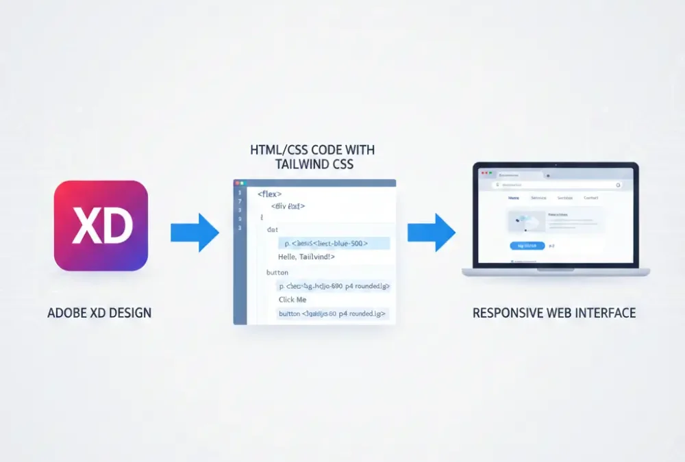
Developers use Adobe XD to create HTML CSS code through Tailwind CSS because this precise process involves transforming design elements into HTML markup while applying Tailwind CSS classes for style application. The guide will lead you through each stage with essential points and professional guidelines to help your conversion run effortlessly. See more blog.
Table of Contents
1. Introduction: Adobe XD to HTML CSS
The software tool Adobe XD provides robust capabilities for developing both interface design and user experience styles. The design tool provides first-rate visual resources that require HTML translation to become operational websites. Busineess processes using pre-built classes receive their designs and styles from Tailwind CSS which functions as a component-based CSS framework.
2. Setting Up Your Project
You should begin by creating the HTML file named index.html. The necessary metadata as well as Tailwind CSS styles should be linked in the <head> section of your document. Users have the choice between using CDN services or establishing a local Tailwind CSS setup.
Code
<head>
     <meta charset="UTF-8">
     <meta name="viewport" content="width=device-width, initial-scale=1.0">
     <link rel="stylesheet" href="https://cdn.jsdelivr.net/npm/tailwindcss@2.2.19/dist/tailwind.min.css">
     <!-- Include other dependencies if needed -->
     <title>Your Adobe XD to HTML Project</title>
</head>
<body>
     <!-- Your HTML content goes here -->
</body>
</html>
3. Analyzing Adobe XD Designs
You need to examine every aspect of your Adobe XD to HTML CSS software within its application. Identify all main elements that comprise headers as well as navigation bars and sections and buttons. Record the combinations of colors and the specifications for fonts together with space distribution.
4. Translating Components to HTML
Each design component needs its own corresponding HTML markup during the creation process. Use Tailwind CSS classes to design the required appearance. As an example we will perform the process of converting headers.
Code
<header class="bg-blue-500 text-white p-4">
     <div class="container mx-auto">
        <h1 class="text-2xl font-bold">Your Website Name</h1>
        <!-- Add other header elements as needed -->

     </div>
</header>
Follow this approach for the navigation bars and other sections of main content and footer which make up your complete design.
5. Mobile Friendly design with TailwindCSS
Users find it simple to generate responsive design elements with Tailwind CSS. Lg:hidden will conceal elements which appear on larger screens and sm:flex activates a flex display when screens become small. Verify your design by assessing it on mobile, tablet and desktop formats to confirm proper responsiveness.
Code
<div class="lg:hidden">This is hidden on large screens</div>
<div class="sm:flex">This is displayed as flex on small screens</div>
6. Handling Images
You should link your image files through the img tag by including the src attribute. The images should receive Tailwind CSS classes to set their dimensions.
Code
<img src="path/to/your/image.jpg" alt="Description" class="w-full h-auto"> 7. Adding Interactivity and JavaScript
All interactive components that appear in your design should include JavaScript implementation. The JavaScript framework in Tailwind CSS is absent so interactive components require additional scripts or external libraries to implement interactive features.
8. Fine Tuning and Customization
Customization of utility classes in Tailwind CSS exists but further adjustments might be necessary. The Tailwind system gives users complete control to match the system with project specifications.
9. When transforming Adobe XD Process:
Method 1: Manual Coding
Export Assets:
You should export all required assets which includes images and icons from Adobe XD To HTML CSS.
Code the HTML Structure:
You must establish an HTML file to write the structure from your design. The coding should include HTML tags that represent headings, paragraphs and divs among other items.
Code the CSS Styles:
Start your HTML element styling by making a different CSS file. You should apply and style the exported assets while defining all styles for colors fonts margins and paddings.
Responsive Design:
Web development through responsive design enables websites to automatically transform themselves across various dimensions of screen size together with different devices and viewing positions. This practice enables websites to display professionally on computers while using tabs and handheld devices with one unified version.
CSS Flexbox or Grid:
The CSS includes media query components to change styling specifications when different screen resolutions are detected. Your design can benefit from CSS Flexbox or Grid to develop structured layouts when dealing with complex designs.
Integrate JavaScript (if needed):
The integration of JavaScript becomes necessary for creating features with interactive elements and animations and dynamic components.
Method 2: Using a Front-end Framework
Choose a Framework:
You should utilize Bootstrap or Foundation as a front-end framework because they help speed up the development process.
HTML Structure with Framework Classes:
Applications of predefined classes in your HTML structure provided by the framework. This can speed up development.
Customize Styles:
The framework documentation allows users to customize their styles according to design specifications.
Responsive Design:
Leverage the framework’s responsive utilities for a mobile-friendly design.
Method 3: Automated Tools
Online Conversion Tools:
Several online tools profess their ability to perform Adobe XD conversion into HTML/CSS format. Check the output code carefully before acceptance.
XD to HTML/CSS Services:
Professional services specializing in converting mobile-friendly Adobe XD to HTML and CSS should be considered by organizations.
Tips:
Review Code and Cross-browser Compatibility:
Carefully check the output code because it requires alignment with your established guidelines for quality control. You should examine your html page through different browser platforms to verify their compatibility.
Optimize for Performance:
Improve your image and code efficiency during optimization processes. Leaning CSS and JavaScript files towards minimal size should be taken into account.
Keep It Clean and Semantic:
The design of better maintainable code requires semantic and clean HTML/CSS writing.
10. Conclusion
Proficiency in design development and close attention to details becomes crucial when converting Adobe XD To HTML CSS designs to HTML/CSS through Tailwind CSS. This detailed guideline will assist you in transforming your designs into operational responsive websites. Read through the Tailwind CSS documentation for complete knowledge about its available classes and customization features. Happy coding!
FAQ: Convert Adobe XD to HTML & Tailwind CSS
Which technical framework offers better benefits between Tailwind CSS and traditional CSS or Bootstrap?
One advantage of utility-first systems is that users do not require making their own CSS classes. It allows developers to save time through direct style application within their HTML files. The tailwind.config.js file enables users to perform easy modifications of Tailwind settings. The performance benefit from using Tailwind comes from its ability to delete unnecessary CSS which reduces file size.
Which steps should be taken to convert Adobe XD into an HTML-based design using Tailwind CSS?
One must select a Tailwind CSS delivery through CDN or npm installation process. The next step is to establish the HTML structure where it is crucial to use HTML elements that maintain semantic meaning based on the original XD design. Elements receive design through utility classes when applying Tailwind CSS syntax.
What approach should I follow to achieve full responsiveness in my converted page?
Adjust styles for different screens by applying Tailwind CSS breakpoints. sm: (640px) for small devices md: (768px) for tablets lg: (1024px) for laptops xl: (1280px) for large screens
Is it possible to implement animations together with interactions while using Tailwind CSS?
Yes! The animation utilities of Tailwind include animate-bounce, animate-spin and additional options. Advanced animations in Tailwind CSS require incorporating Framer Motion or GSAP.
The HTML file receives integration capability for a CMS structure between WordPress and React.
Yes! Following conversion the HTML files with Tailwind CSS coding become integrable with WordPress and Next.js alongside Vue.js and all backend programming frameworks.
The conversion services from Adobe XD to Tailwind CSS are available through your company.
Yes! We provide quick services to deliver pixel-perfect responsive conversion designs. Let’s discuss your project! 🚀
